Journal

On material, light and restraint.

Notes from the studio: what we notice, what we leave out, and why a room usually needs less than one expects.

The room as an instrument: why acoustics belong to interior design
Editorial

The room as an instrument: why acoustics belong to interior design

08 · 2026 · 6 MIN READ

A room sounds before it is seen. Entering an apartment, you hear its reverberation time within the first second, long before you consciously register the colour of the wall. Hard parallel surfaces of glass, plaster and stone bounce sound back and forth until voices turn sharp and people speak more quietly without knowing why.

A beautiful room in which nobody likes to talk is not a finished room.

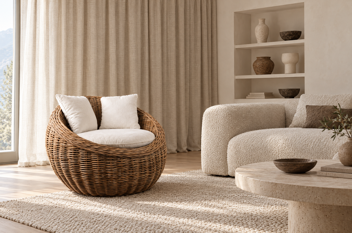
In living spaces a comfortable reverberation time lies somewhere between 0.4 and 0.6 seconds. Above that a room turns echoing, below it dull. That range is rarely reached with acoustic panels; it is almost always reached with things that belong in the room anyway: a heavy linen curtain across the full width of a wall rather than only around the window, a thick wool rug with underlay, a sofa in open boucle rather than smooth leather.

Diffusion matters just as much. A smooth empty wall returns sound as one block. An open niche with objects of differing heights, a shelf of books, a woven basket or a rattan chair break that reflection into many small parts. This is precisely why a room with few but textured objects sounds calmer than an empty one.

In practice that means acoustics are decided in the concept, not repaired at the end. During sampling we test not only how a fabric looks but how the room sounds with it. It is the cheapest gain in comfort an interior can offer.
The art of leaving out
Journal

The art of leaving out

07 · 2026 · 4 MIN READ

The most common cause of a restless room is not the wrong object but the fifth right one. Every object claims attention. Put five of equal weight side by side and they divide that attention so evenly that none of them works any more.

Reduction is not an aesthetic, it is a decision about hierarchy.

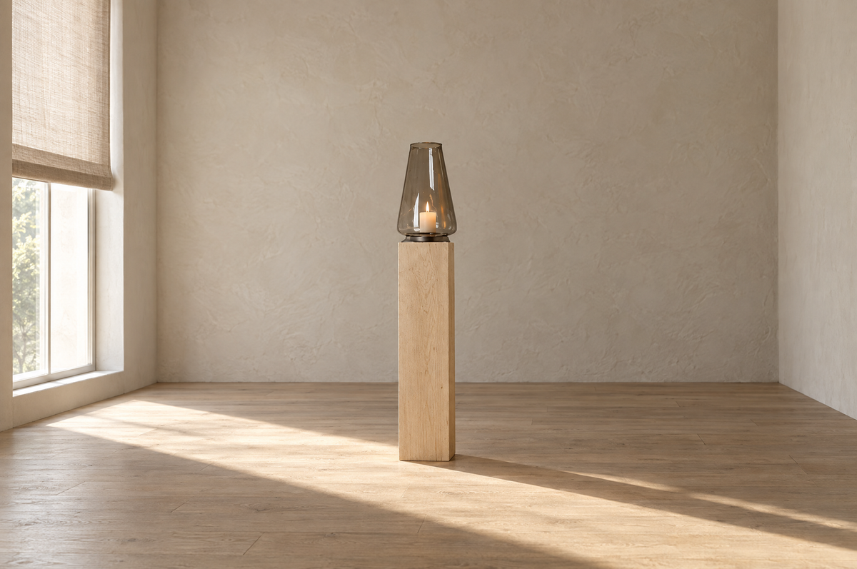
So we work with a simple rule: one principal object per field of view, one companion, and then emptiness. The principal object may be large, dark or glossy; the companion picks up one of its qualities and drops the rest. Anything further is not added, it is removed.

Emptiness is not a sacrifice here. The empty wall beside a single object is the reason that object is seen at all. Filling a room takes the stage away from its pieces. Emptying it gives the stage back.

The practical exercise takes ten minutes: empty a room completely and put back only what you miss. As a rule two thirds stay out, and nobody notices.

Neutrals with depth
Journal

Neutrals with depth

06 · 2026 · 5 MIN READ

Beige is not a colour, it is a craft. Lay five beiges side by side and you see at once that they differ not in brightness but in undertone: one leans pink, the next green, the third yellow. Mix those undertones and you do not get a calm room, you get a muddy one.

A neutral room is built from texture, not from the absence of colour.

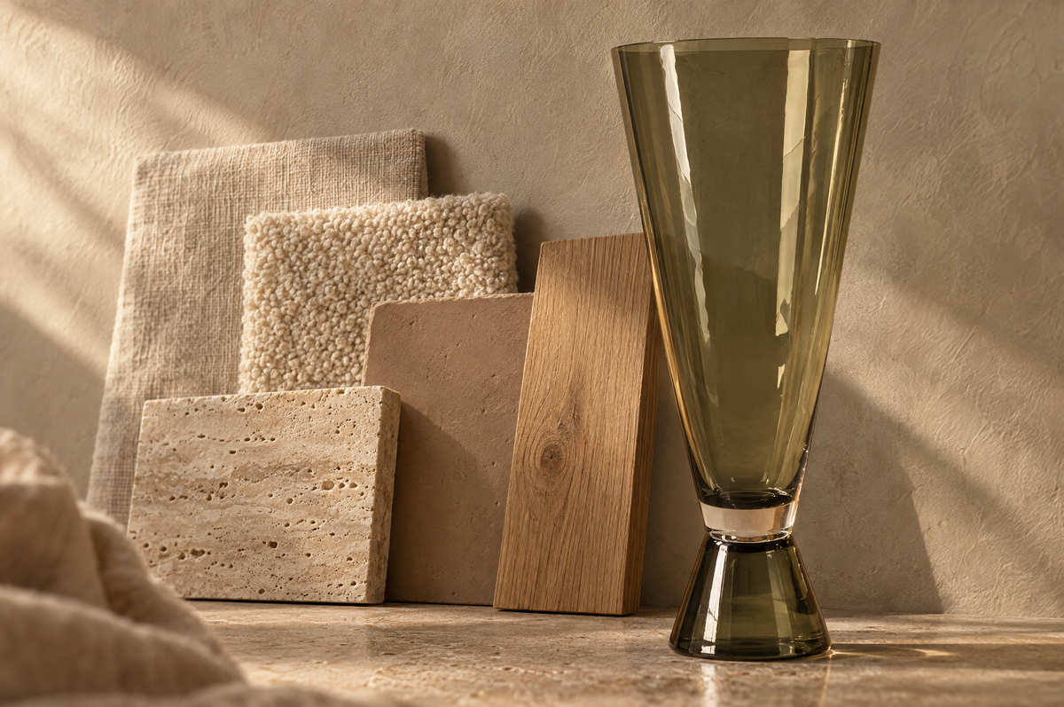
Our rule: one undertone for the whole scheme, then depth through material. Undyed linen, raw wool, unglazed clay, oiled oak and travertine can share the same colour value and still read as five clearly distinct surfaces, because each returns light differently.

Then there is colour temperature. A warm greige reads sandy under 2700 Kelvin and grey under cool north light. This is why we always sample colours in the room itself, at two times of day, and never only on a fan deck in the showroom.

Hold the undertone and vary the texture and you can paint an entire apartment in a single colour without any room resembling the next.

Light as a building material
Journal

Light as a building material

05 · 2026 · 6 MIN READ

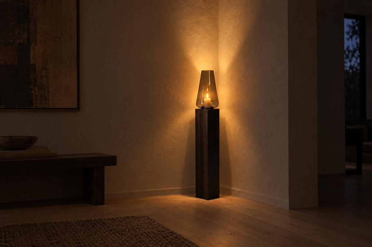
Light changes proportion faster than any building work. A single source washing a wall upwards makes a room appear taller. The same amount of light spread flat from the ceiling makes it read lower and wider. In neither case was anything built.

Even brightness is not a lighting concept, it is the absence of one.

So we plan in layers rather than in fittings. Layer one is orientation, very low and usually indirect. Layer two is dwelling, at head height and warm, the layer that decides whether a room feels comfortable. Layer three is accent, tightly focused, for exactly those objects that deserve it.

Colour temperature follows height: the lower a source sits in the room, the warmer it may be. A candle at 1800 Kelvin near the floor feels natural; the same colour on the ceiling feels wrong. Choose fittings by appearance alone and you notice this only once everything is installed.

In the end the same holds for light as for objects: the best solution is usually the one with one source fewer, placed where it counts.

Newsletter

Stay up to date.

New objects, material finds and room ideas from the Muolen showroom, plus first word on collections before they go online. Roughly every two weeks, unsubscribe at any time.